Music Video
The Vision
After the Director came up with a concept for the music video, the director and I heard the song and came up with the vision for it first. The Director wanted to incorporate an Indie level music video. My mind immediately thought of Wong Kar Wai until we started talking about the references.
The Director started running me through his primary references: “Fall at the same time” by Aldn. After which, I got a better understanding of his vision with the production and then from there I brought on my own visuals that layered his vision. Most of the music video is set up on the street, so I thought of adapting street cinematography from “Uncut Gems”. “Durag Activities” fit more in alignment with the visual aesthetic we wanted to bring in for the music video. We primarily also studied Blood Orange’s style (the artist) for his music videos, and found a middle ground between the Director’s vision and the artist’s style.
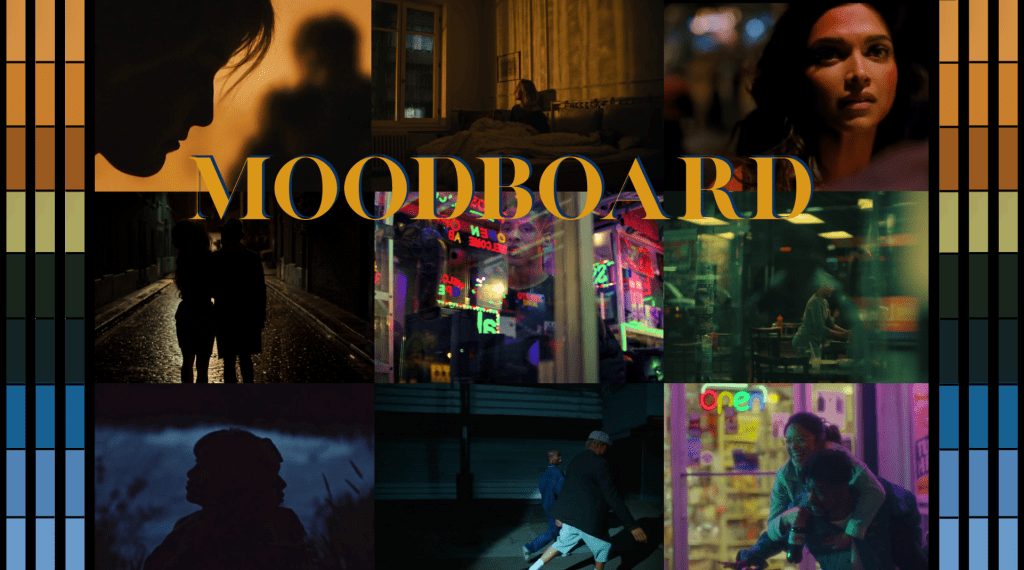
The Moodboard
The lens choice played a vital role in the narration with me restricting the minimum focal length to normal lens (>45mm) & telephoto lens (<270mm). These lens choices really allowed the music video to feel intimate and force the two characters to appear in tighter spaces.
In terms of the color choice, the director and I divided it into three primary colors reflecting across the music video with orange, green and blue. These three primary colors reflect the cycle of any relationship: orange gives off a very warm feel symbolizing the start of a relationship, green has a very natural feel to it symbolizing the comfort of being in a relationship, and blue is a negative emotion showing sadness, symbolizing the destiny of their relationship (Them breaking up).
The framing choices purely reflect the nature of their relationships as well with a lot of golden eye ratios along with the aspect ratio of 1.33. The director and I really wanted our audience to feel this organized chaos through a box across each and every frame. We have also incorporated a technique of having dirty frames through light leaks, and pushing the abstract of each frame. We felt that having a lot of handheld camera movements would really add up to this feel as well. Personally, along with creating tight spaces, I narrowed my T-Stop range strictly from 2.8 to 1.4 in order for the frames to be a lot more tight.
The Equipment List
Because our production was spread across four to five locations, each with extremely limited space, I had to build an equipment list that was tailored to every single location along with creating one master list for the entire shoot. This forced a level of efficiency that became essential to the way we operated. My camera assistants relied heavily on these location-specific lists. It streamlined our workflow, minimized clutter, and ensured that we only transported the equipment we only needed.
The Visual Language
From my earliest conversations with the Director, we knew the project needed a singular, cohesive visual language, something that connected each location emotionally. We landed on water. Not just as a motif, but as a metaphor for the fluidity and shifting states of their relationship. We incorporated water in multiple forms: reflections on the street, water caustics dancing across the apartment walls, even small particulate water inserts that added texture to transitions. All of these elements built a thematic continuity that felt organic to the narrative.
Production
The Location Breakdown
During pre-production, we had location scouted each and every shoot location prior to the shoot dates, and for some we even managed to have a tech recce for them. So here are the stills from the tech recce and location scouts. My gaffer and I really went through the lighting of each and every location with all the logistics details, and here is the breakdown:-
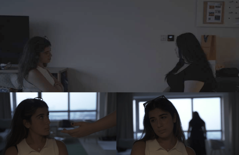
The Apartment
- The water caustics had to particularly fall on the right wall of the frame in the main master shot meaning the fish tank had to be on the left.
- However, there was a balcony on the left, and the area overall was very cramped up because of the heavy production design.
- There was TV in the area, acting as a reflective surface.
Production:- On set, we coordinated with the production designer, and opened up the balcony on the left, kept in the fish tank on a table visible in the frame, added a water fountain to act as a motivation for the water ripples, and blasted an Aputure 300x with a Gobo through the fish tank for the defined water ripples on the wall.
Arcade
- We were not allowed to switch off the ceiling lights.
- We were not allowed to get big lights, and just accentuate the practicals we had access to.
- So my gaffer and I decided to expose each frame by breaking the lighting layers down, by particularly bringing down the exposure of the background without me having to hit my T-Stop range.
Production:- Here is the solution we came up with during pre-production and here is how we executed it during production. We put an ND 4 stops filter on while filming, cutting down light by 4 stops with obviously the subjects and my background being underexposed. From there, my gaffer accentuated the practicals by having smaller lights like Aputure MC Pros resulting in our subjects being perfectly exposed allowing my colorist to achieve the look we have wanted.
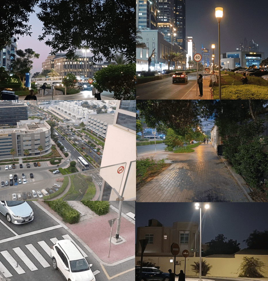
The Street
- It’s an open area, and it’s very difficult to control light spill.
- We weren’t allowed to have bigger light equipment.
- Limited time available per location
- We have a master shot of our actors running in the street with us filming them from the 13th Floor of a building.
- The Sunrise window was very limited for the last scene in terms of time.
Solution:-
We used Aputure MC Pros to subtly light the actors’ faces. I rolled at a base ISO of 3200, which gave us a clean, well-exposed image while keeping our lighting package minimal. For the shot captured from the 13th floor, I had already arranged during preproduction for a 130mm paired with two 70mm focal extenders, allowing me to reach a 270mm focal length and achieve the focal length needed for that shot. During the location recce, I used the Sun Surveyor app to track the exact sunrise position, and on the shoot day we timed the window shot to match that moment perfectly. For the light leaks, since lens whacking wasn’t possible with our rig, we created them by hitting the bare lens, without a matte box, with a flashlight for just a split second, giving us the abstract, organic flares we were chasing.
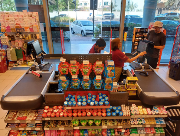
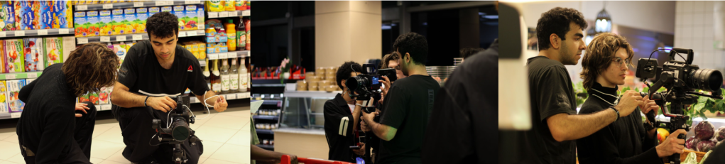
The Supermarket
- Not allowed to switch off any ceiling lights
- Limited shooting time
- One and a long shot
- Actors and extras were blocked in specific areas
- Exposing the outside and inside of the supermarket.
Solution
For the supermarket interiors, I exposed the Blackmagic Pixis 6K specifically with that location in mind, since a major portion of the sequence unfolds there. My camera was mounted on the DJI RS3 Pro, giving us controlled movement while still maintaining a grounded feel. For this shot, the Director and I intentionally wanted focus breathing, allowing the actors to drift in and out of focus to reflect the instability of their relationship. This required the camera operator to maintain a consistent distance from the actors, treating the movement almost like a dance. In terms of lighting, we relied heavily on the existing practical ceiling fixtures, accentuating them while flagging off unwanted light spills to carve more shadow across the actors’ faces.
Post Production:-
The groundwork that the colorist and I established during pre-production made the grading stage feel incredibly streamlined. Since we had already aligned our approach to ISO, contrast handling, and the overall tonal palette, post became more of a supervisory process for me. My role was simply to ensure that the colors, especially the water-driven textures and the emotional transitions between orange, green, and blue, remained consistent throughout the music video. Because of the conversations we’d already had, there were very few surprises in the grade. It allowed us to maintain the integrity of the visual language we created on set.
What can be improved
Looking back, I think the project would have benefitted from more time in pre-production, especially in terms of aligning the visual language and solidifying the technical decisions before stepping on set. On my end, I should have spent more time understanding the Director’s vision at a deeper level, storyboarding every frame and distinguishing our own ideas from the references we admired. The Director and I got carried away with those references, and while they inspired us, they occasionally overshadowed our original intent. Because of that, our vision going into the edit felt divided, and that disconnect naturally became apparent in post.
-A.P Advik Arora
